View
Back to work
Conceptual UX Redesign 2025

Letterboxd

Conceptual redesign of Letterboxd as a daily user. The app has a strong concept but is missing the surfaces and actions that would make it genuinely engaging. I redesigned six screens covering the full core experience.

User Redesigned what I use daily
6 Screens redesigned
Social Comments, likes, recs
iOS Mobile-first, 2025
Letterboxd profile redesign

Good concept, missing the loop

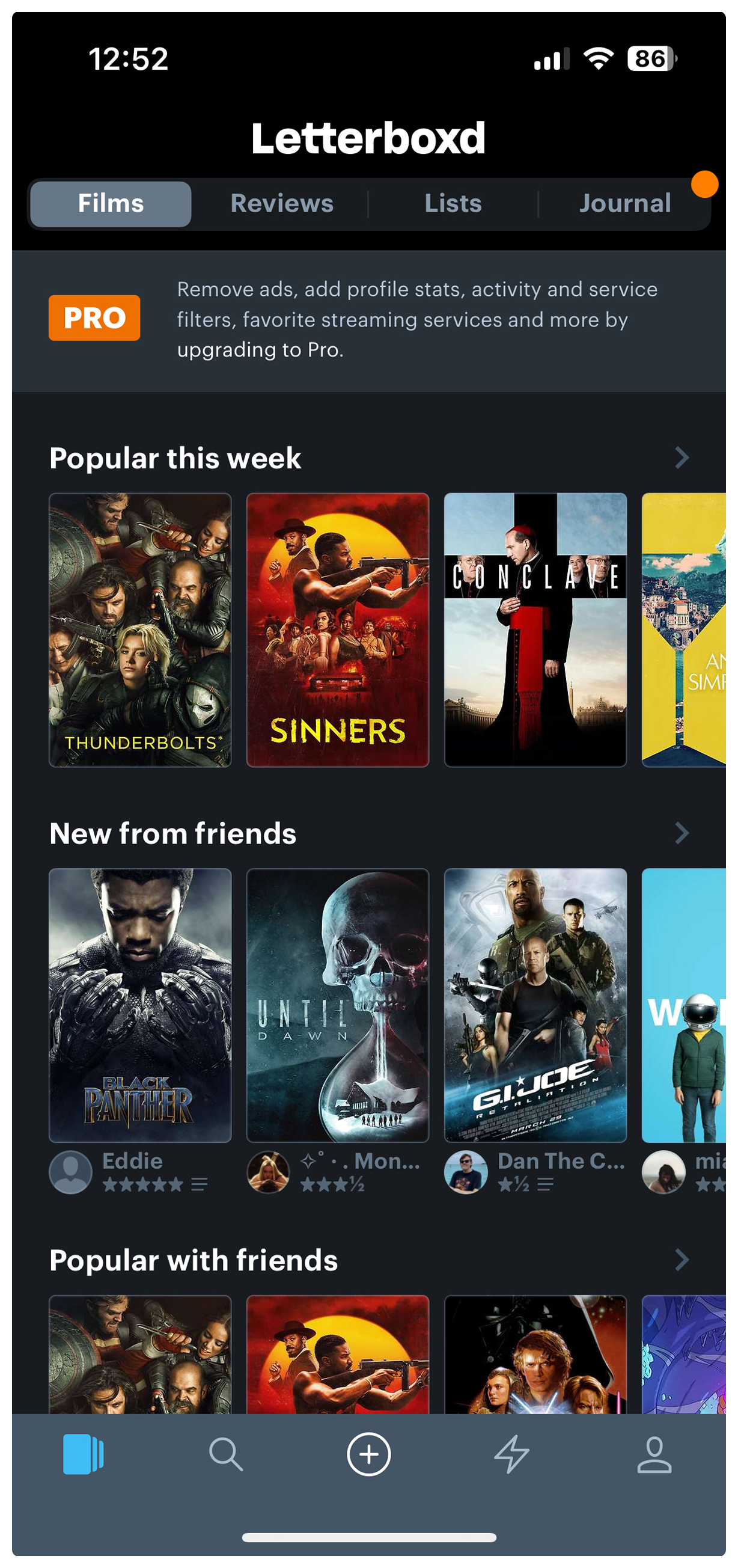
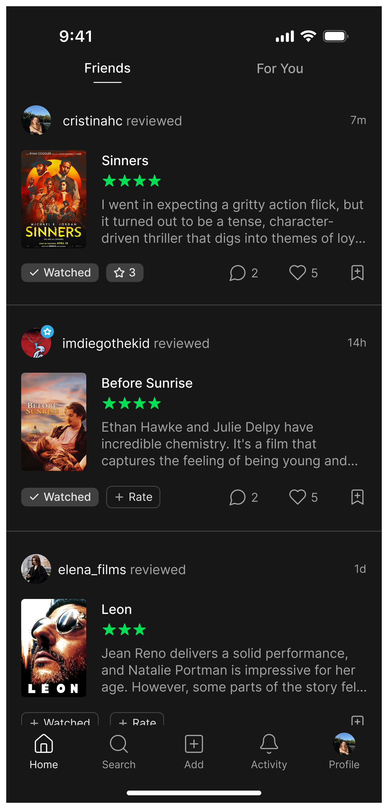
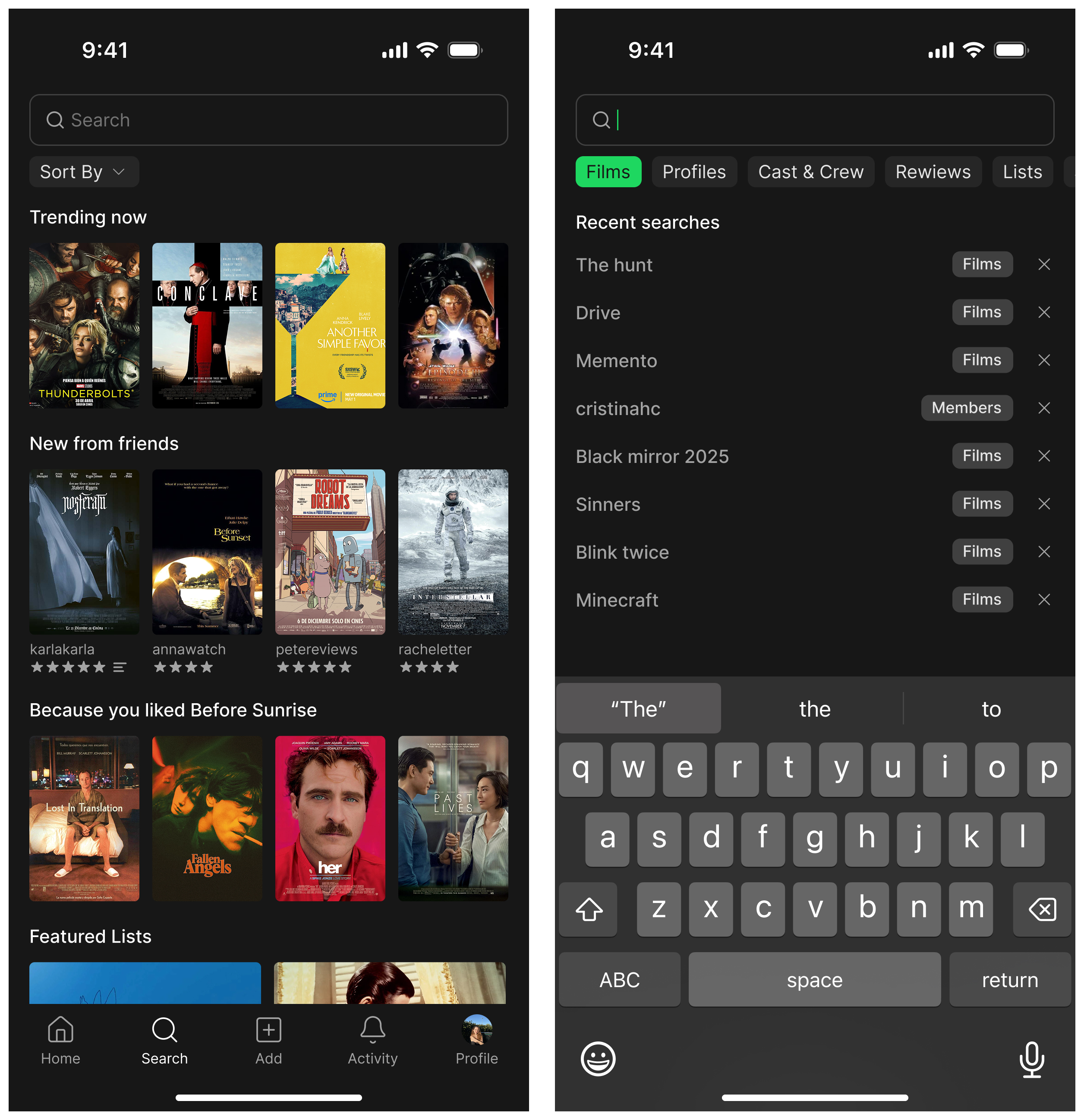
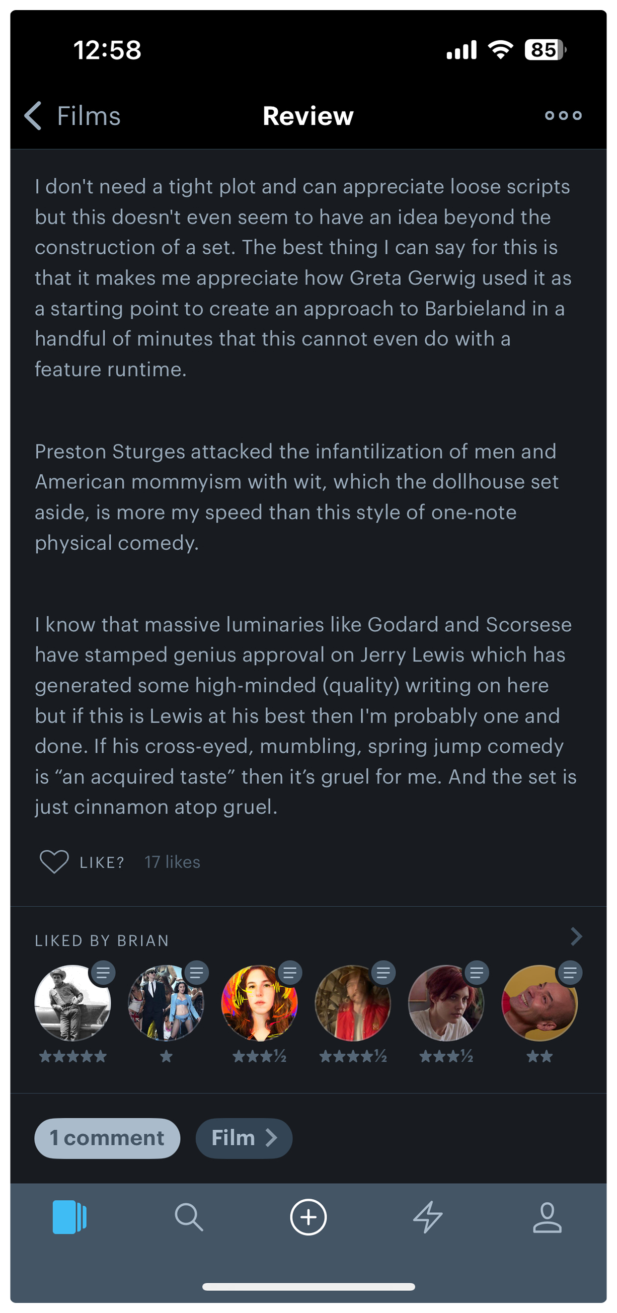
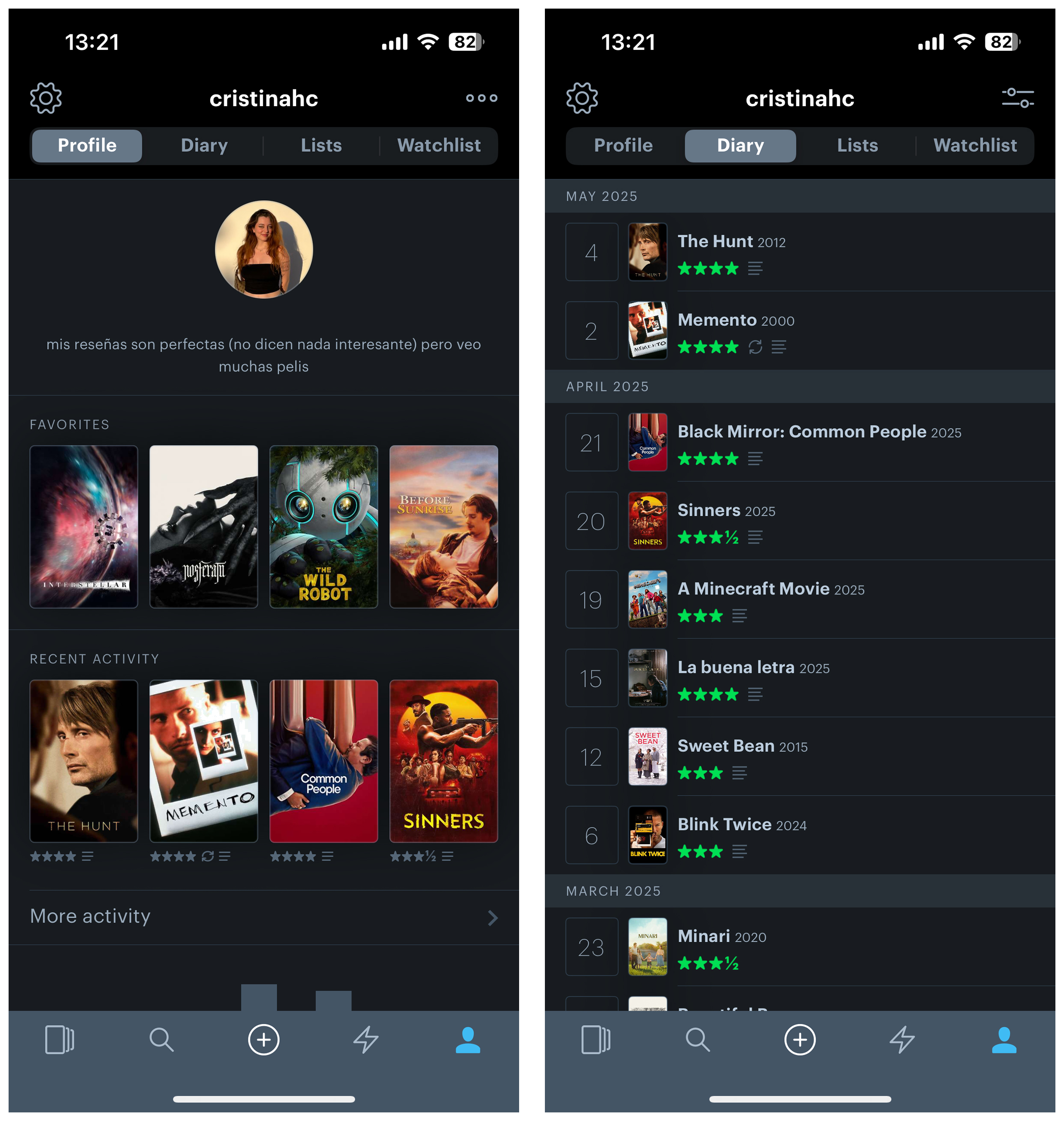
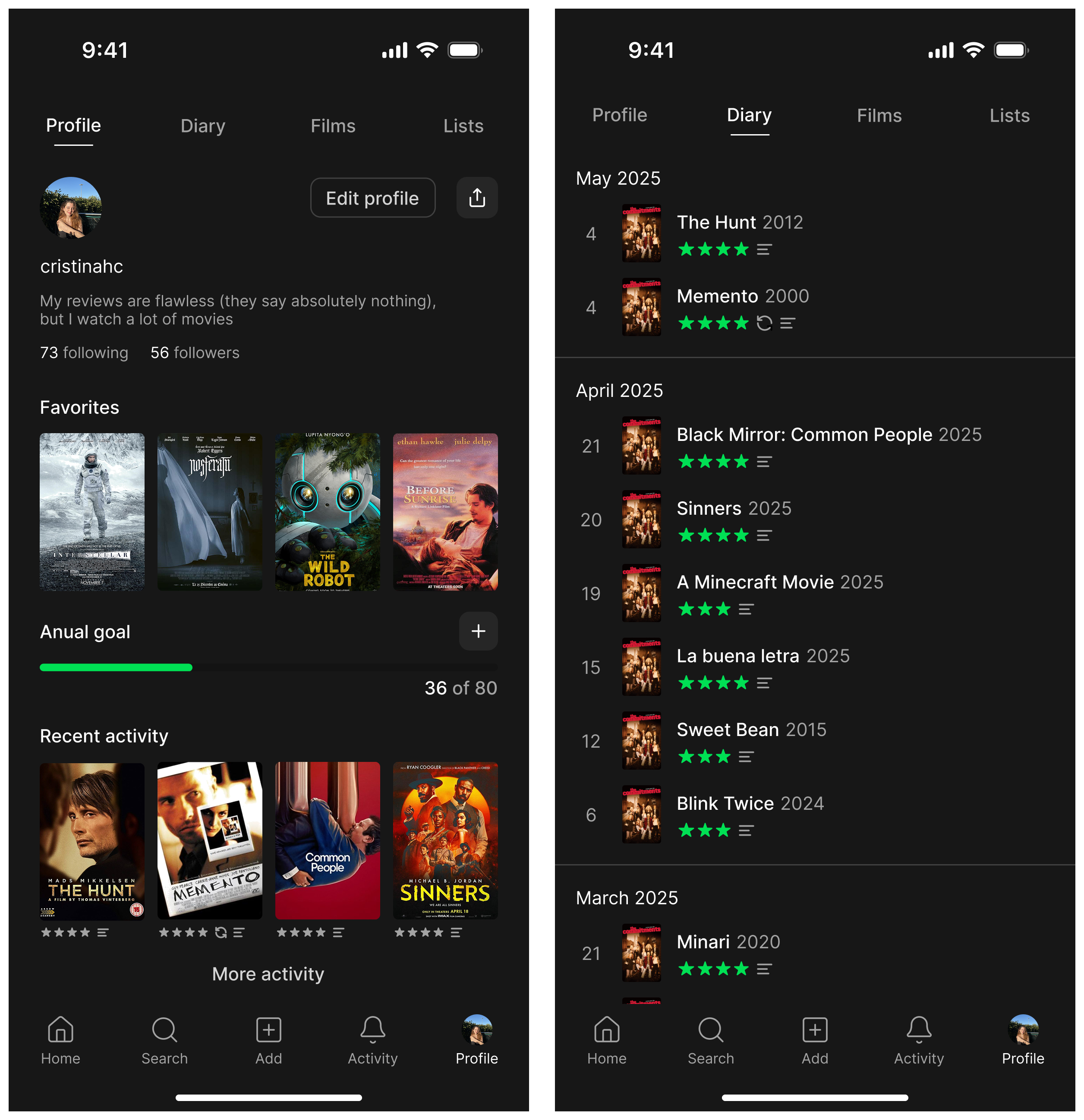
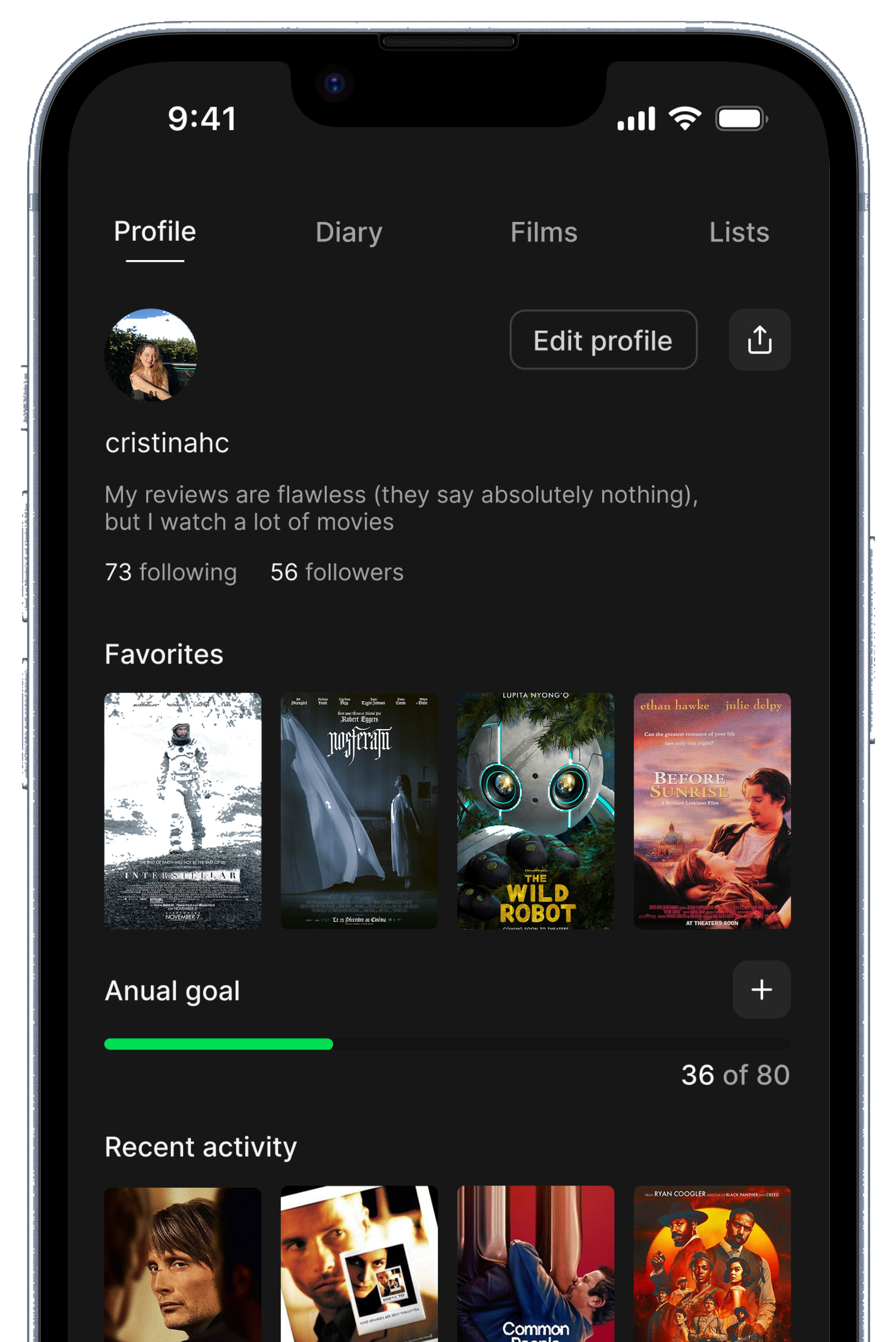
I use Letterboxd regularly. It has one of the most passionate communities in consumer tech and the core concept, a social network built around film, is genuinely good. But as a daily user, the gaps are hard to ignore. The home exists but is not built as a feed. There is no social layer on reviews. Recommendations are absent despite years of taste data. The profile shows numbers but does not reflect who you are as a film person.

No client, no brief, no constraints. Just a designer who uses the app and knows exactly what is missing.

The Goal

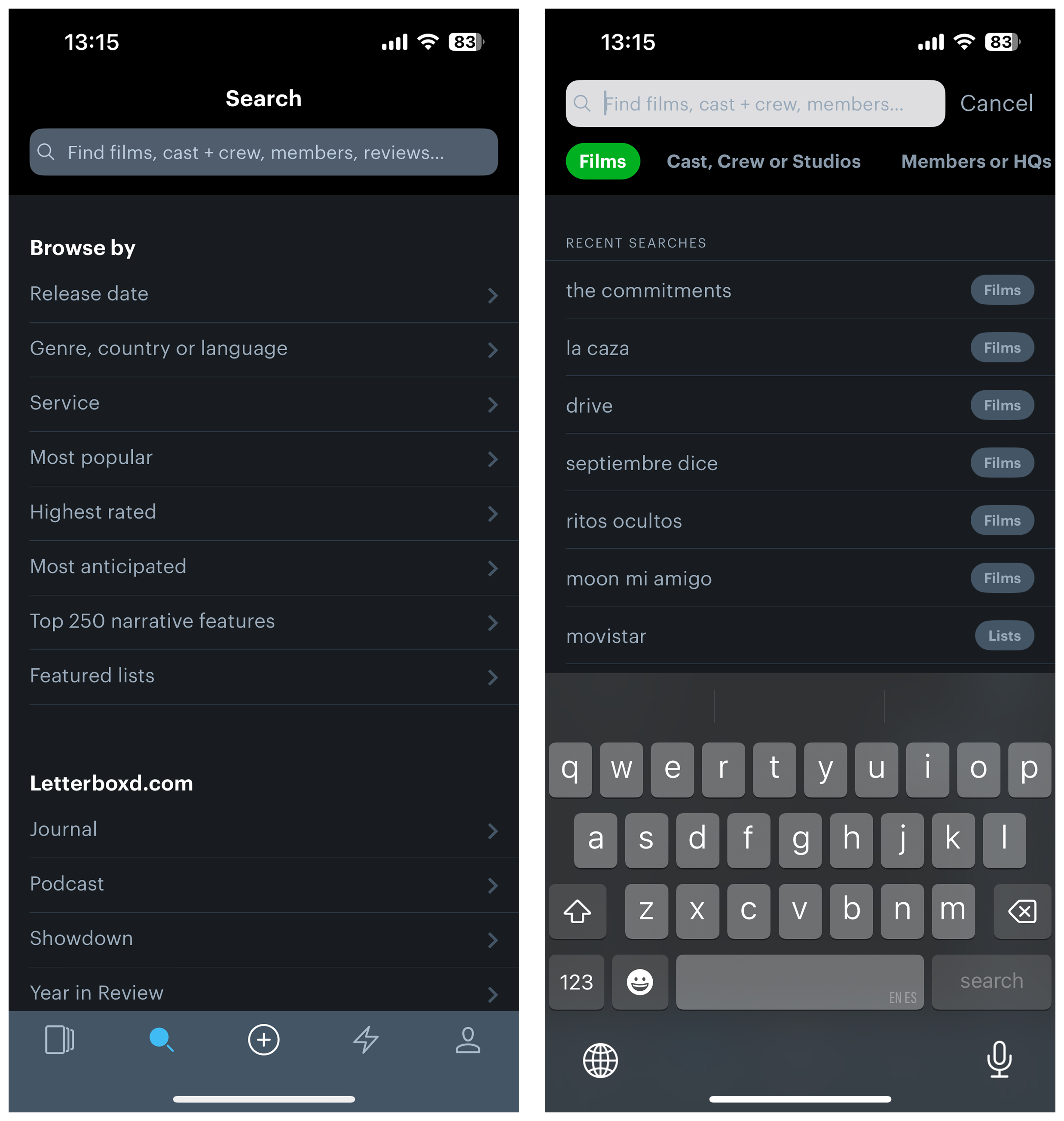
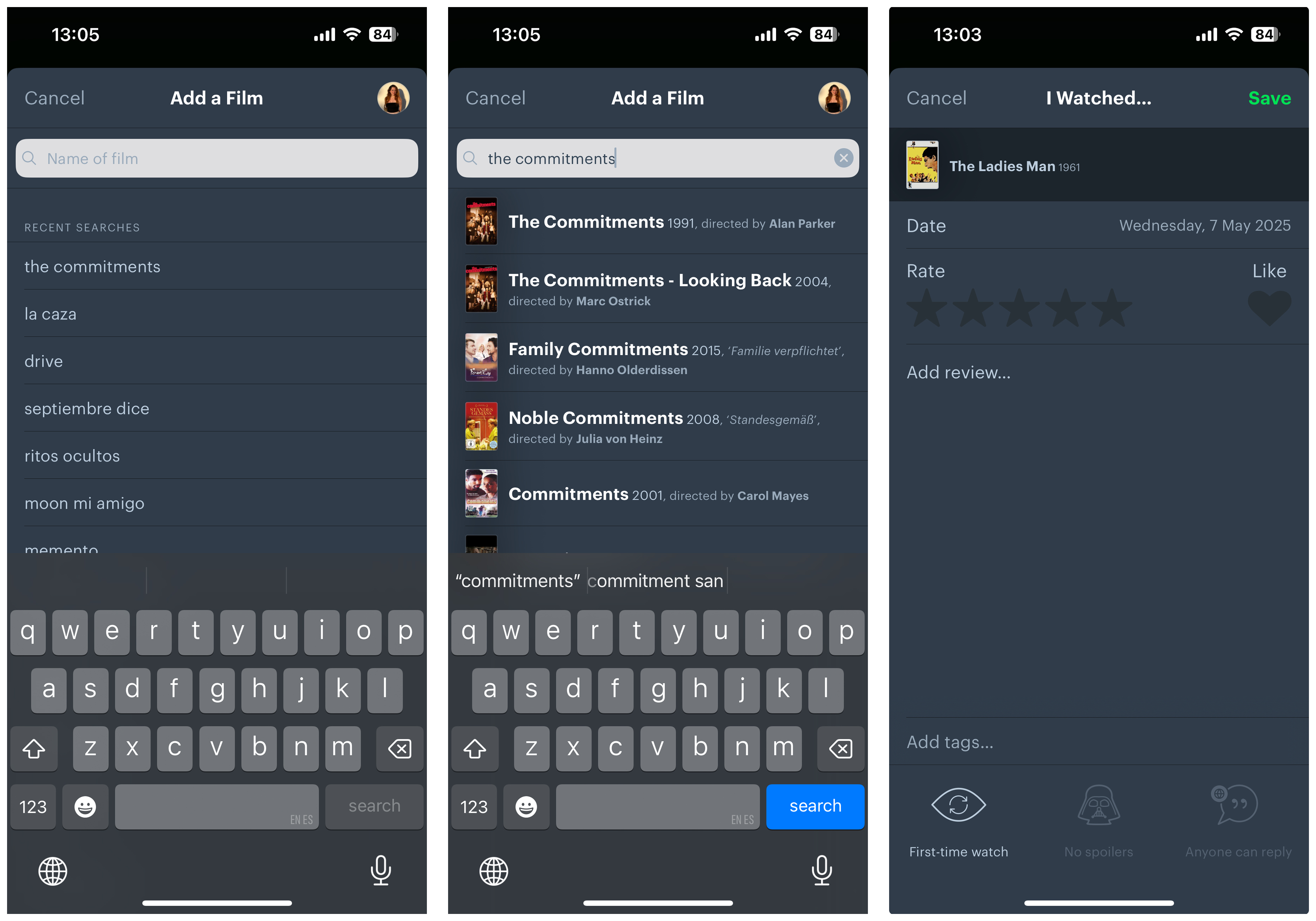
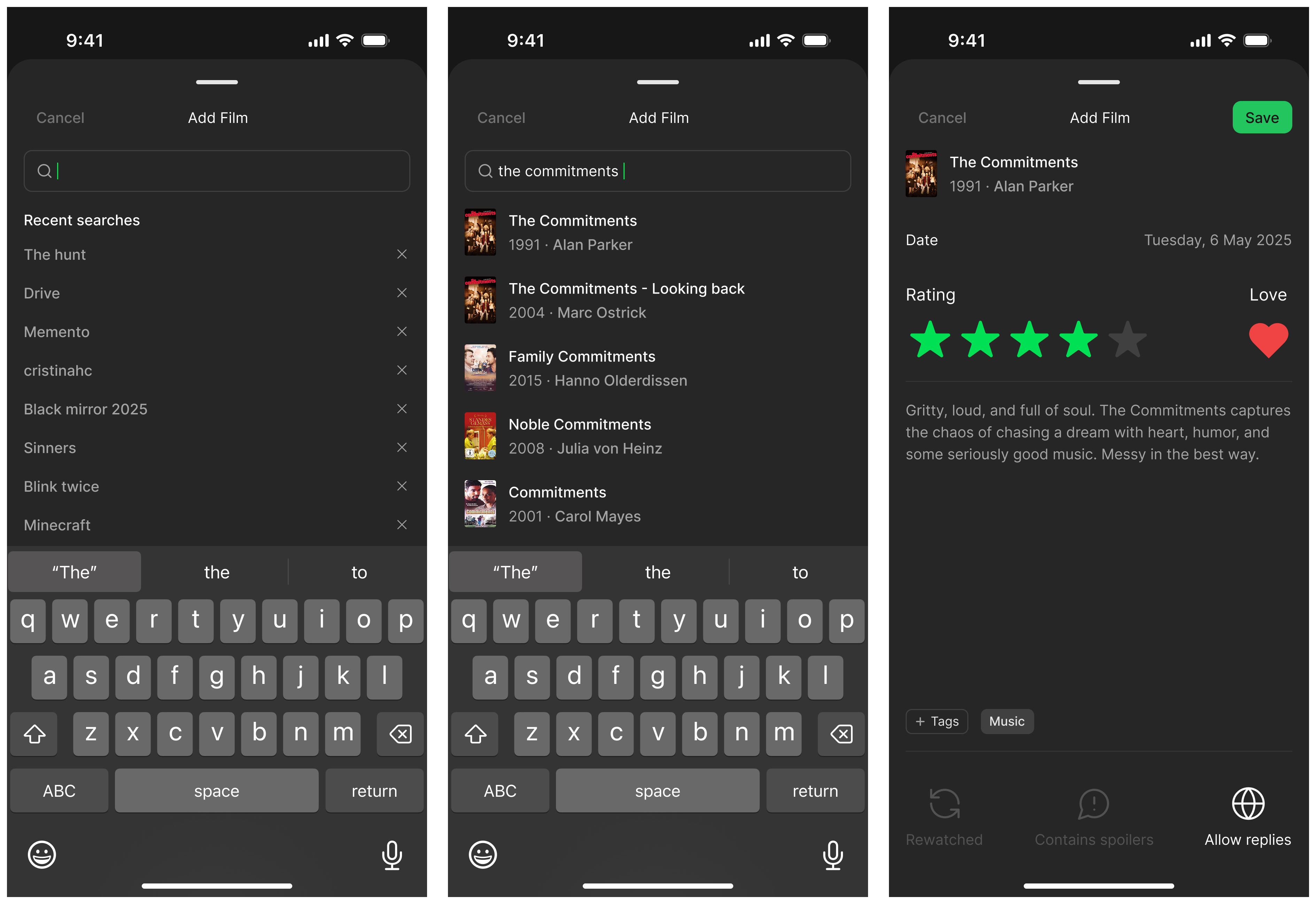
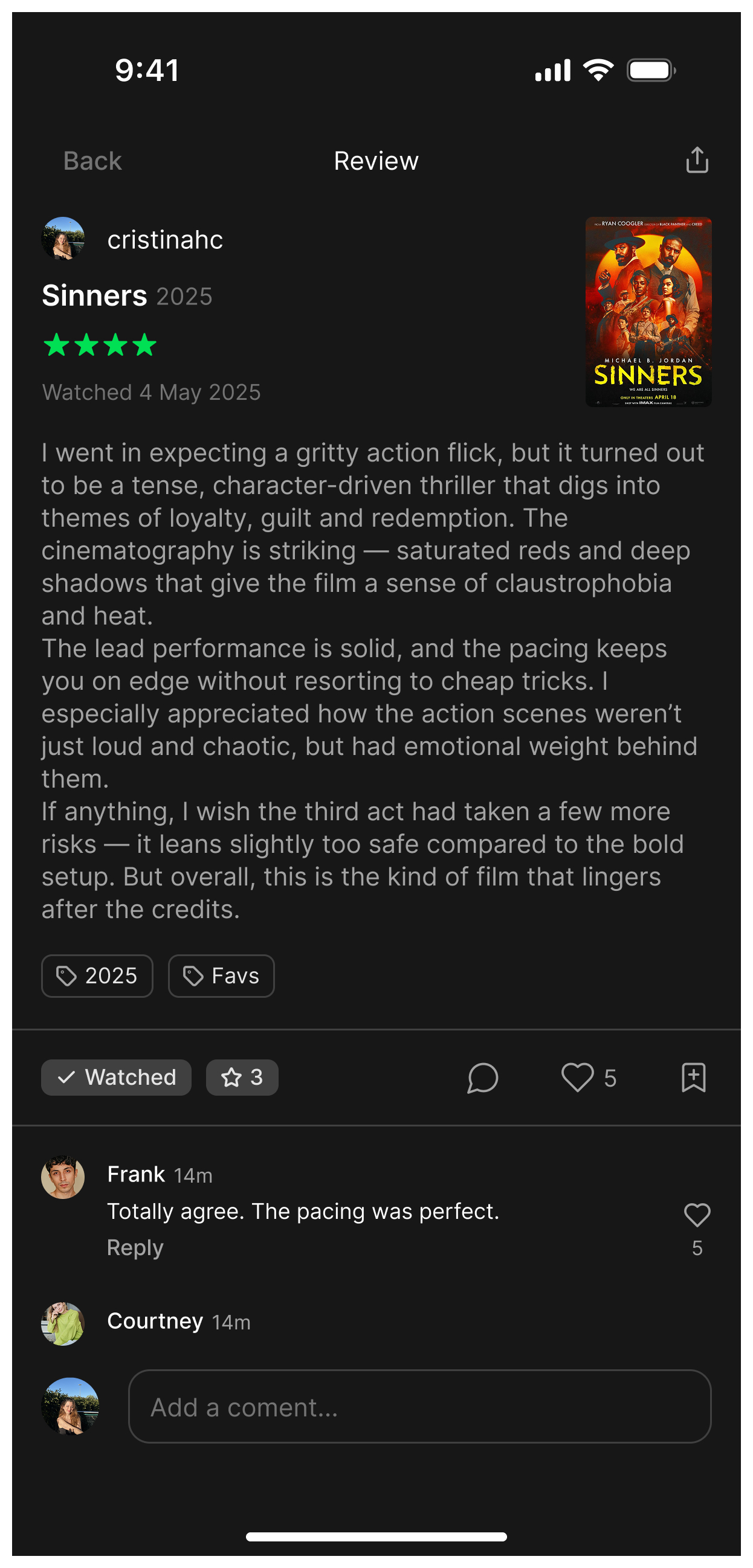
Redesign the five core screens to close the engagement gap. Turn the home into a real feed, add social mechanics to reviews, introduce recommendations, improve the logging flow, and rebuild the profile around identity.

What a daily user notices

Starting from my own experience and App Store reviews, I mapped what was frustrating and what was missing. The problems split into two categories: surfaces that exist but do not work as feeds, and social mechanics that simply are not there.

Daily user
Research from lived experience
No feed
Home exists, not built as feed
App Store
Reviews to validate pain points

Key insights

01
The home does not pull you in. Letterboxd has a home screen but it is not built as a feed. There are no Friends or For You tabs, no curated picks, no structured activity from your network. Nothing gives you a reason to open the app without a specific film in mind.
02
Reviews exist but are not social. You can write a review, but you cannot comment on a friend's, react to it, or share it easily. The social graph is there, the mechanics to activate it are not.
03
Taste data goes unused. Users have years of ratings in the app and none of it is used to surface new films. The profile shows numbers but no identity. Recommendations would make users feel heard and give them a reason to keep logging.

01 / Home

BEFORE
Letterboxd current home screen
AFTER
Redesigned Letterboxd home with Friends and For You feed tabs

The home gets two tabs: Friends and For You. Friends shows what your network has reviewed recently, with the review excerpt and quick actions inline. For You surfaces trending films and personalised picks. The bottom nav is also redesigned: Home, Search, Add, Activity, Profile, with a clear primary action always reachable.

02 / Search and recommendations

BEFORE
Current Letterboxd search screen
AFTER
Redesigned search with trending, new from friends, and taste-based recommendations

Search becomes a discovery surface. Beyond the search bar, it now shows Trending now, New from friends (films your network recently logged), and a recommendations section based on your taste. "Because you liked Before Sunrise" surfaces films similar to what you have rated highly. This is the feature that makes users feel the app knows them.

03 / Add film

BEFORE
Current Letterboxd add film flow
AFTER
Redesigned Add Film with recent searches, richer logging options, tags and love button

The logging flow keeps your recent searches visible so returning to something you were considering is immediate. The logging screen itself gains more depth: a love button alongside the star rating, tags for cataloguing your entries, and toggles for rewatched, contains spoilers, and allow replies. Small additions that make the core ritual more personal and more useful.

04 / Review

BEFORE
Current Letterboxd review screen
AFTER
Redesigned review with comments, likes, share and status actions

Reviews gain a full social layer. A comments section lets users reply to each other directly. Likes and a bookmark action are always visible. A share button makes it easy to send a review outside the app. Status pills (Watched, Rate) give context at a glance. These are the actions that turn a review from a private note into a conversation.

05 / Profile

BEFORE
Current Letterboxd profile screen
AFTER
Redesigned profile with favorites, annual goal progress, recent activity and diary

The profile is rebuilt around identity. A favorites section lets you pin the films that define your taste. An annual goal with a progress bar makes the habit of watching visible and motivating. Recent activity shows your last logs with posters. Tabs for Profile, Diary, Films, and Lists organise everything without hiding it. The diary tab gives a clean chronological view of everything you have watched, by month.

From passive log to active platform

This is not a visual refresh. Turning the home into a feed, making reviews social, and using taste data for recommendations is a shift in what the product does. From something you open when you remember a film to something you check every day because there is always something to see.

Home
Daily entry point
friends + for you
Recs
Taste-based discovery
based on what you logged
Social
Reviews as conversations
comments, likes, share
Profile
Identity, not just stats
favorites, goal, diary
Reflection

Designing for a product you use every day is a different kind of exercise. You know exactly what is missing, but you also have to stay honest about why it might not exist yet. The constraints you set yourself end up being the hardest ones to defend.

×
Next Project xNova International