View
Back to work
First Designer 0→1 DS Trade Data 2025

xNova International

First product designer at xNova. Full ownership over product design and UX on an international trade data SaaS: from a complete platform audit and design system to user interviews, new features, and day-to-day technical team management.

First Designer at xNova
0→1 Design system built from scratch
E2E Audit to production
Active Current role

Drag to compare

BEFORE AFTER
xNova redesigned interface
xNova original interface

Same company profile view. Before and after the redesign.

Some designs are under NDA

Due to confidentiality agreements, I can't show all the platform designs publicly. If you'd like to see the full work, additional screens, flows and design decisions, you can access them with a password.

No design, just developers shipping screens

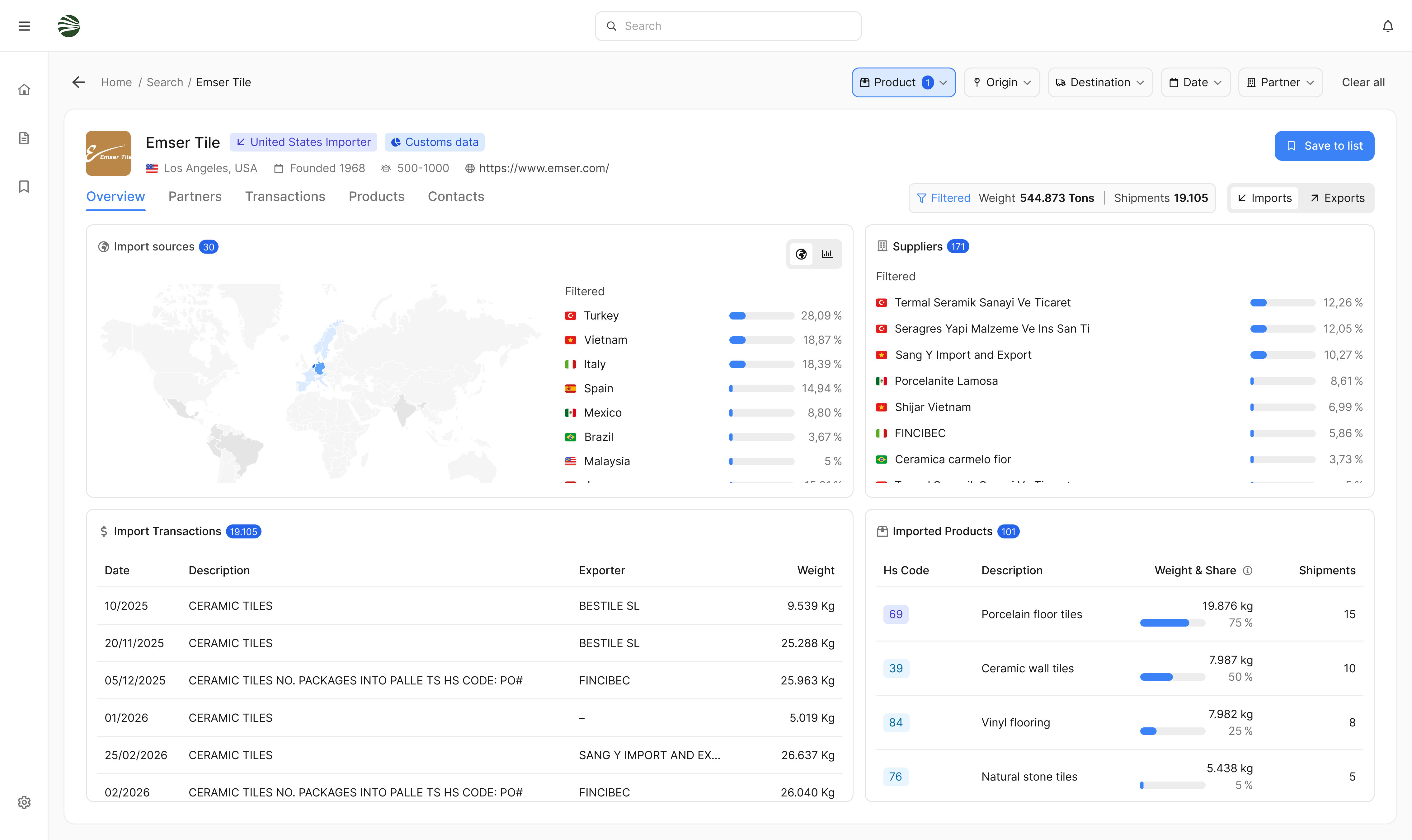
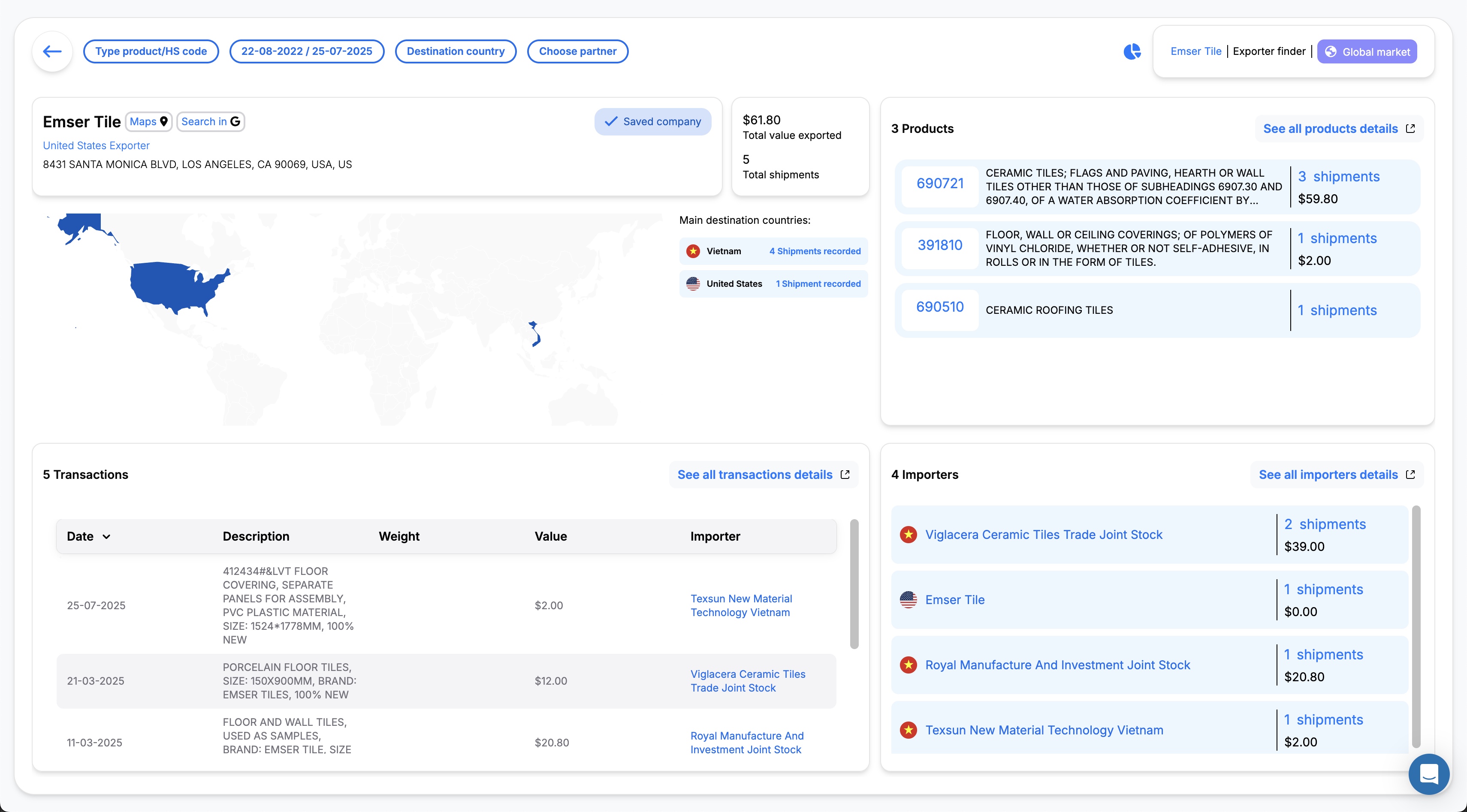
xNova International is a B2B SaaS for international trade data. Export managers at large companies use the platform to understand who to sell to and track what their competitors are doing. The data is complex, which makes clarity and usability not a nice-to-have but the core requirement of the product.

When I joined as the first product designer, there had never been a designer on the team. Developers had been making all UX and UI decisions on the spot, with no shared system and no user input. Every screen looked different. Actions were hard to complete. The learning curve was steep because nothing was intuitive. The platform needed a foundation.

My role covers everything: full platform audit, design system, user interviews, new features, improvements to existing flows, visual refresh of the platform, technical team management with task creation and follow-up, QA sign-off, and frontend implementation of designs and design bug fixes using AI. I open PRs that engineers review and merge. I have final say on experience and design decisions alongside the stakeholders.

The Goal

Create a foundation and build from it. A design system that unifies the product, a clearer interface for export managers working with dense data, new features based on real user needs, and a design process that gives the team structure to keep improving.

Learning what export managers actually need

Before touching a single component, I spend time learning the product and its context. xNova serves a specific kind of user: export managers at large companies, people dealing with dense international data every day. Understanding how they work, what they rely on, and where the platform gets in their way is essential before making any design decisions.

I do a full audit of the entire platform, map every screen and UI element, catalogue all inconsistencies, and run user interviews to understand real workflows and where users get stuck.

No DS
No design system, no tokens, no shared components when I joined
7+
Button variants found in production, all slightly different
Audit
Full platform review across every screen before designing anything

Key insights

01
Everything was built ad-hoc. Each screen had been built independently by developers making design decisions in the moment. Nothing was unified, nothing could be reused, and there was no shared language between design and development.
02
Hard to use without prior learning. Actions required multiple steps and the interface was not intuitive. Users needed to already know the product well to use it effectively, which raised the barrier for everyone.
03
Complex data needs a clear interface. Export managers work with dense information every day. If the interface adds friction on top of data complexity, the product fails its core purpose. Clarity is not a visual preference, it is a functional requirement.

Audit, system, product, repeat

The process has several phases. First, a full platform audit: mapping every screen, identifying inconsistencies, and understanding the component landscape. Then the design system: token architecture, 36 components, all documented on ZeroHeight. Then, working from the user interview findings, new features and improvements to existing flows. And running alongside all of this: managing the technical team, creating and tracking their tasks, doing QA on everything before it reaches production, and implementing designs and fixing design bugs in the frontend using AI. I open PRs that the engineering team reviews and merges.

The design system is built bottom-up: foundations first, then components, then governance. Tokens are named semantically, not blue-500 but color.interactive.primary, so the system can scale. All 36 components ship with usage guidelines on ZeroHeight and are tracked with a status system (Ready, In progress, New) so the whole team always knows what is available.

View the design system on ZeroHeight
Before. Fragmented
Developers making all UX and UI decisions
No design system, no tokens, no shared library
Every screen inconsistent, hard to learn ⚠
No user interviews, no user input in decisions
No handoff process or documentation
No QA against design intent
After. Systematised
Design leading all UX and UI decisions ✓
36 components, token architecture, ZeroHeight docs ✓
Consistent, intuitive interface across the platform ✓
User interviews informing new features and improvements ✓
Structured handoff process with dev notes ✓
QA sign-off on every release ✓
Frontend implementation via AI, PRs reviewed by engineers ✓

A product with a foundation

The design system is now the operational backbone of the product. Components are documented, versioned, and referenced by engineers in every sprint. The platform has a consistent look and feel for the first time, and new features are being designed and shipped based on real user needs. The team has a clear process: design leads, developers build, and nothing reaches production without QA sign-off.

36
Components shipped
all documented on ZeroHeight
Platform consistency
unified look across all screens
Users
Research-driven features
built on real interview findings
QA
Full sign-off process
nothing ships without review
Reflection

Being the first designer at a company that has never had one means you are building the process as much as the product. The hardest part is not the design system itself. It is earning the trust of a technical team, establishing a way of working, and making the case every day for why design and user research actually change the outcome.

Enter password to view designs

Incorrect password. Try again.

Next Project Fourvenues